
Tooltips for Forms
Tooltips for forms used judiciously can provide help at the very moment it's needed.
Form field labels generally convey what type of information is desired for form fields. But sometimes labels aren't enough.
A zip code field may accept only one format, the 9-digit USA zip code format, for example. A tooltip could explain that USA residents need to provide the 9-digit version of their zip code and, for residents of other countries, to leave the field blank.
This article provides information about two ways of presenting form tooltips:
-
The tooltip presented in the normal flow of the form. A div with the tooltip is inserted into the form, perhaps above the label or between the label and the form field the tooltip applies to. The tooltip may be closed or left open to continue with filling out the form.
-
The tooltip presented over the form. A div with the tooltip is published on top of the form. The tooltip is closed before the user continues with filling out the form.
In this article, "click" means "tap" for touch-screen devices.
Tooltip Examples
Here are examples of both types. How-to information follows.
Example tooltip in the normal flow of the form.
When the "?" in a circle is clicked, the tooltip appears between the label and the form field, pushing the field down to make room. To close the tooltip, click the "?" again or click the "X" at the right of the tooltip.
Your full name.


Example tooltip over the form.
When the "?" in a circle is clicked, the tooltip appears over the top of the field. To close the tooltip, click the "?" again or click the "X" at the right of the tooltip.
Your full name.
Constructing a Form Tooltip
This diagram illustrates the various visual parts that are affected when constructing a form tooltip.
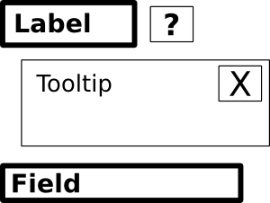
The thicker bordered parts are the ones generally present in a form. In the earlier examples, the label is the "Your full name" text. (The label is optional; some form designs use within-the-field placeholder hints instead.)
The thinner bordered parts are the elements composing the form tooltip. Here's a description of each.
? — The "?" part is an icon or text or button to click for revealing the tooltip. It may be positioned after the label text, like in the earlier examples, or elsewhere.
Tooltip — The "Tooltip" part is a div or other HTML block element that contains the content of the tooltip.
X — The "X" part is an icon or text or button within the tooltip div, generally at the upper-right corner but can be elsewhere, to click for hiding the tooltip. This is optional, as clicking the "?" part a second time will hide the tooltip. The "X" part is included here because it may be more intuitive than clicking "?" a second time.
The illustration shows the visual parts of a form tooltip. A part that's not visual is the JavaScript that displays and undisplays the tooltip content.
The Form Tooltip Source Code
The first example form tooltip:
The following source code is for the example tooltip in the normal flow of the form. Notes follow.
<p style="margin-bottom:3pt;"> Your full name. <a href="javascript:ReverseDisplay('tooltip-for-first-example')"> <img src="//www.willmaster.com/library/images/CircleWithQuestionMark.png" style="width:14px; height:14px border:none; outline:none;" alt="?"> </a> </p> <div id="tooltip-for-first-example" style=" display:none; position:relative; border:1px solid #999; font-size:smaller; line-height:100%; padding:3pt 9pt 3pt 3pt; background-color:#efefef;"> <div style=" position:absolute; top:0; right:0;"> <a href="javascript:ReverseDisplay('tooltip-for-first-example')"> <img src="//www.willmaster.com/library/images/CircleWithX.png" style="width:14px; height:14px border:none; outline:none;" alt="X"> </a> </div> Your full name is your full legal name — your first name, any middle names you have, and your last or family name. </div><!-- id="tooltip-for-first-example" --> <input type="text"> <script type="text/javascript"> function ReverseDisplay(id) { var d = document.getElementById(id); if( d.style.display == "none" ) { d.style.display = "block"; } else { d.style.display = "none"; } } // function ReverseDisplay() </script>
The following correlate to the illustration further above. The code for the example is colored as noted below.
Label — The code for the "Label" part is colored blue. You'll see it in two parts, the second part being only the closing paragraph tag.
? — The code for the "?" part is colored green. It's an icon or text or button to click for revealing the tooltip. It's positioned on the same line after the label text in the example, but may be positioned anywhere.
The lightgray background is the tooltip div id value. It tells the JavaScript the id of the tooltip when "?" is clicked.
Tooltip — The code for the "Tooltip" part is colored red. It's in two parts, divided by the embedded code for the "X" icon. The CSS code can be pretty much what you decide for style except it does need a position:relative; declaration so it can be revealed within the normal flow of the form and a display:none; declaration to hide the tooltip until needed.
The lightgray background is the tooltip div id value. It's how the JavaScript identifies it when it's time to display or undisplay the tooltip. If you make more than one tooltip div, each will need a different id value.
X — The code for the "X" part is colored purple. It's an icon or text or button within the tooltip div to click for hiding the tooltip. In the example, it's at the upper-right corner of the tooltip, but can be elsewhere.
The lightgray background is the tooltip div id value. It tells the JavaScript the id of the tooltip when "X" is clicked.
Field — The code for the "Field" part is colored gold. It's the form field to accept information provided by the user.
The JavaScript — The code for the JavaScript part is colored black. The JavaScript is placed anywhere on the page. But only once. If you have more than one tooltip, each will use the same JavaScript.
Copy the code into a temporary web page and tweak to get the design you want. Then duplicate the functionality for each form field that will have a tooltip. The tooltip div will need a different id value for each instance so the JavaScript knows which tooltip to display or undisplay.
The second example form tooltip:
The following source code is for the example tooltip over the form. Notes follow.
<div style="position:relative;"> <p style="margin-bottom:3pt;"> Your full name. <a href="javascript:ReverseDisplay('tooltip-for-second-example')"> <img src="//www.willmaster.com/library/images/CircleWithQuestionMark.png" style="width:14px; height:14px border:none; outline:none;" alt="?"> </a> </p> <div id="tooltip-for-second-example" style=" display:none; position:absolute; top:9pt; left:0pt; border:1px solid #999; font-size:smaller; line-height:100%; padding:3pt 9pt 3pt 3pt; background-color:#efefef;"> <div style=" position:absolute; top:0; right:0;"> <a href="javascript:ReverseDisplay('tooltip-for-second-example')"> <img src="//www.willmaster.com/library/images/CircleWithX.png" style="width:14px; height:14px border:none; outline:none;" alt="X"> </a> </div> Your full name is your full legal name — your first name, any middle names you have, and your last or family name. </div><!-- id="tooltip-for-second-example" --> <input type="text"> </div><!-- style="position:relative;" --> <script type="text/javascript"> function ReverseDisplay(id) { var d = document.getElementById(id); if( d.style.display == "none" ) { d.style.display = "block"; } else { d.style.display = "none"; } } // function ReverseDisplay() </script>
The coloring for this second example correlates to the coloring of the first example, with one addition. Because the tooltip is placed over the form, the placement needs to be relative to something. That's the div colored white on black.
Other changes are mentioned below. The same color scheme applies, only the code itself changed.
? — Colored green. The tooltip id was changed from tooltip-for-first-example to tooltip-for-second-example (the area marked with lightgray background).
Tooltip — Colored red. Within the red area, the value of the CSS property position was changed from relative to absolute and the declarations top:9pt; and left:0pt; were added to place the tooltip over the form.
The tooltip id was changed from tooltip-for-first-example to tooltip-for-second-example (the area marked with lightgray background).
X — Colored purple. The tooltip id was changed from tooltip-for-first-example to tooltip-for-second-example (the area marked with lightgray background).
Remember to use the JavaScript only once per page. If you have more than one tooltip, each will use the same JavaScript.
As with the first example, copy the code into a temporary web page and tweak to get the design you want. Then duplicate the functionality for each form field that will have a tooltip.
Some or all form fields may have tooltips. The above should get you started.
The tooltip div can be designed as you wish.
You have permission to download the "?" and "X" icon files and use them with your forms. We prefer you don't pull the icon files from willmaster.com as we may change things without notice.
The tooltip content can be text and/or images, even audio or video where appropriate.
(This article first appeared in Possibilities ezine.)
Will Bontrager