
Height-Responsive Web Pages
Height-responsive pages have elements that adjust depending on the height of the browser window.
As a mental comparison, in width-responsive pages elements adjust themselves depending on the width of the browser window. Height-responsive is a corollary; elements adjust according to the browser window height.
As examples, height-responsive elements may be used when an image needs to be the same height as the browser window, or heading text must all fit into the window. There are other examples, two of which you'll find in the article.
Height-responsive coding can be a fun pursuit. Especially once you get the hang of it.
Successful height-responsive coding requires one term be thoroughly understood: viewport
The viewport is the window within the browser where the web page is displayed. The viewport height is not the web page height, but the height of the window that displays the web page.
In this reduced screenshot of a browser, the viewport is outlined in red.
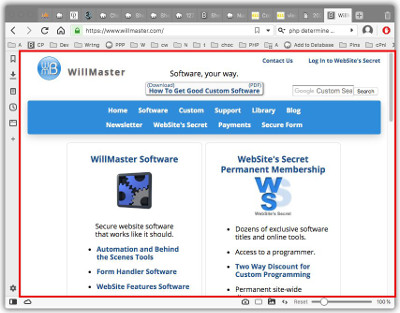
As you see, the viewport does not include the icons and tools that are part of the browser, just the window that displays the web page.
Scrollbars generally are considered to be part of the viewport because they are within the window within which the web page is displayed.
There are two ways CSS can be used to make something on the page be responsive to the height of the viewport:
-
To maintain the height of an element on the web page as a percentage of the height of the viewport. If the height of the viewport changes, the height of the element also changes.
-
To change the style of an element on the web page when the height of the viewport is past a specific point.
Both of those are addressed in this article.
Maintain Height as Percentage of Viewport Height
The viewport height is accessed with the CSS vh property. The height of an element on a web page can be maintained at a percentage of the height of the viewport.
In use, vh specifies a percentage of the viewport height.
Thus, 20vh specifies 20% of the viewport height. And 100vh specifies 100% of the viewport height.
Here is a div with 20vh specified as the height. The height of the div is maintained at 20% of the viewport height.
Changing the browser height causes the above box to grow taller or shorter. If you are on a phone or tablet, changing between portrait view and landscape view will change the box height accordingly.
Here is the code to duplicate the above demonstration.
<div style="height:20vh; border:1px solid #333; border-radius:1em; padding:1em; overflow:auto;">
The height of this box is always 20% the height of the browser viewport.
</div>
A 100vh style can be used to publish an image at the height of the viewport — as an example of use.
Also, a 100vh style can be used when an iframe height needs to be maintained at the height of the viewport. I'm not going to provide an example of that because I don't want to create a big empty space for you to scroll past. But here is code:
<iframe src="https://example.com/" style="height:100vh; width:100%;"></iframe>
If no content is above or below the iframe, it can not be scrolled past. But if there is such content, the web page can be scrolled up or down to reveal the rest of the content.
Adjust Style When Viewport Height Passed a Point
A CSS @media query can be used to change the style of an element when the height of the viewport is above or below a certain point.
Here is a demonstration. When the height of the viewport is 400 pixels or less, this div is 75 pixels high and has a golden background. Otherwise, the div is 150 pixels high and has a sky blue background.
Here is the code to replicate the above example. Then, we'll talk about it.
<style type="text/css">
#media-query-demo { height:150px; background-color:skyblue; padding:1em; overflow:auto; }

@media screen and ( max-height:400px ) {
   #media-query-demo { height:75px; background-color:gold; }
}
</style>

<div id="media-query-demo">
When viewport is higher than 400 pixels, you'll see a sky blue background in a 150 pixels high div. Otherwise, you'll see a golden background in a 75 pixels high div.
</div>
In the above code, in both the style section and the div section, you'll see the media-query-demo id value. The media-query-demo CSS affects the div with id value media-query-demo.
The @media query change point is max-height:400px.
When the web page first loads, the media-query-demo div will be height:150px; background-color:skyblue; — unless the height of the viewport is 400 pixels or less, in which case the @media query kicks in and the div will be height:75px; background-color:gold;.
After the page loads, whenever the browser viewport is higher than 400 pixels then the div will be 150 pixels high with a sky blue background. Whenever the viewport's height is 400 pixels or less, the div will be 75 pixels high with a golden background.
Any CSS style can be changed with @media queries. The @media query change point can be at any height.
A lot can be done with the two ways for a web page style to be height responsive. Interesting things. Fun things. For clients and for yourself.
(This article first appeared with an issue of the Possibilities newsletter.)
Will Bontrager