
Rounded Images and Cutouts
CSS can make a rectangular image appear rounded on the web page, as an oval or a circle. It can also be used to publish sections of an image (referred to in this article as cutouts).
Here is an example of an oval:
The image is a rectangular image, which is why you see an oval. Forcing the image dimensions into a circle would make the height and width disproportionate to the original.
Here is an example of such distortion:
There is a way to present a circle "cutout" of a rectangular image without shrinking or stretching one of the image dimensions.
Let's first present the code for the previous two examples. Then, talk about rounded images without shrinking an image dimension.
Here is the code for the first one, the oval. Notes follow.
<div style="max-width:250px;">
<img
    src="https://willbontrager.com/images/candy/IMG_1213-575-creamy.jpg"
    style="max-width:100%; border-radius:50%;"
    alt="picture">
</div>
Notes —
A div that contains the image has a max-width:250px; CSS declaration. When you implement this on your own site, give your div a maximum width no larger than the width of the image.
The image style max-width:100%; ensures that the image will be no larger than the space in the div and, also, to not stretch if the image happens to be smaller than the div dimensions.
The image style border-radius:50%; tells the browser to make the image into an oval relative to the image dimensions (if height and width were identical, it would make a circle).
Now, let's present the code for the second example, the circle.
<div style="width:250px; height:250px;">
<img
    src="https://willbontrager.com/images/candy/IMG_1213-575-creamy.jpg"
    style="width:250px; height:250px; border-radius:50%;"
    alt="picture">
</div>
Notes —
width:250px; height:250px; style the div into a perfectly formed square.
width:250px; height:250px; make the dimensions of the image identical so it can form into a perfectly formed circle.
The image style border-radius:50%; tells the browser to make the image into a circle (if height and width were unequal, it would make an oval).
How to Make a Circle Cutout
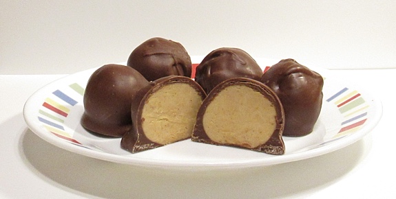
First, here is the entire image. We'll make a circle cutout from the image.
Let's first cut out a circle at the top-left of the screen. (The image is not resized, just a section cut out. The rest of the image is hidden and takes up no space on the page.)
Here is the code for that. (Notes follow.)
<div style="width:250px; height:250px; border-radius:50%; overflow:hidden;">
<img
    src="https://willbontrager.com/images/candy/IMG_1213-575-creamy.jpg"
    alt="picture">
</div>
Notes —
The width:250px; and height:250px; specify the size of the div.
border-radius:50%; shapes the div as a circle.
The image itself is allowed to render full size. Only the cutout part displays in the div because of the overflow:hidden; CSS declaration.
Now, let's move the cutout within the image 20 pixels down from the top and 200 pixels in from the left.
You see a different part of the image within the cutout.
Here is the code.
<div style="position:relative; width:250px; height:250px; border-radius:50%; overflow:hidden;">
<img
    src="https://willbontrager.com/images/candy/IMG_1213-575-creamy.jpg"
    style="position:absolute; left:-300px; top:-20px;"
    alt="picture">
</div>
Notes —
Only the new CSS declarations are highlighted. See the previous example for reference to the others.
The div has position:relative; added. The reason is to establish it as the reference div for the image position.
The image has position:absolute; added. This tells the browser that the image positioning is to be relative to the div (because the div has the position:relative; declaration).
The left:-300px; and top:-20px; CSS declarations tell the browser how much to shift the image position under the div. The result is a circle to view that particular part of the image.
What you have now is instructions to publish rounded images. And to publish image cutouts.
Depending on the page and general website design, rounded images can be a professional design element.
Note: Images are from the Amish Recipes: Chocolate‑Covered Candy web page.
This article first appeared with an issue of the Possibilities newsletter.
Will Bontrager