
Simple Responsive Web Page Template
The responsive web page template in this article is as simple as my current writing and tech skills can make it.
You'll find 2 columns. The main column for the main web page content is on the left. The navigation column is on the right. On web pages with narrow screens, the columns are stacked with the main column above the navigation column.
To keep it simple, no extraneous CSS is used. There are only 4 classes. There is 1 media tag. And the body tag is styled for font size.
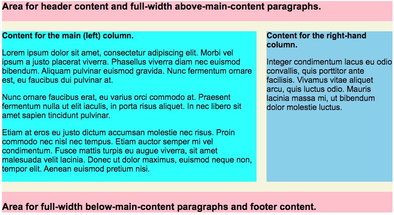
Each of the CSS classes has a temporary background color specified. The reason is to clearly show what areas of the page the individual classes affect. Here is a screenshot in a scrollable image.
When you have your web page working, specify additional styling as you see fit.
The CSS
Let's do the style sheet first. The background color of the source code for each of the 4 classes is the same background color as the area of the page is will affect — as seen in the above screenshot image.
<style type="text/css">
@charset "utf-8";

body {
   font-size:100%;
   }

.full-page-content-container {
   max-width:1000px;
   margin:0 auto;
background-color:pink; /* temporary */
   }

.flex-content-container {
   display:flex;
   flex-wrap:wrap;
   justify-content:center;
background-color:beige; /* temporary */
   }

.flex-main-column {
   width:calc(100% - 250px - 20px);
   margin:20px 0;
background-color:cyan; /* temporary */
   }

.flex-right-column {
   width:250px;
   margin:20px 0 20px 20px;
background-color:skyblue; /* temporary */
   }

@media screen and (max-width:650px) {
   .flex-main-column {
      width:100%;
      }
   .flex-right-column {
      margin:0;
      }
   }
</style>
For the colored areas of the style sheet source code, refer to the screenshot image further above.
Pink
At the pink colored background, the .full-page-content-container class, you'll see a maximum width for the content publication area of the page and a margin definition that centers the location of the div within the browser window.
Both are optional. If you don't mind the content extending from left to right margins regardless how wide the browser window is, the max-width declaration can be omitted. The margin declaration is unneeded if you wish to have the content publication area against the left margin even if it doesn't extend all the way to the right.
On the screenshot image, you'll see the pink at the top and the bottom. If it wasn't for the other colors on top of the pink, the entire image would be pink.
Beige
At the beige colored background, the .flex-content-container class, you'll see essential flex definitions. The definitions are basic flex definitions that are needed for manipulating the columns as you'll see in the cyan colored and skyblue colored areas of the screenshot image.
On the screenshot image, you'll see the beige at the top and the bottom. If it wasn't for the other two colors on top of the beige, the entire section would be beige.
On the screenshot image, you'll see the beige around the 2 columns. It is where the 2 columns reside.
Cyan
At the cyan colored background, the .flex-main-column class, you'll see the essential CSS for the main content column. There, you'll find a width declaration and a margin declaration.
The calc() definition for CSS width value needs to be explained.
The browser does the calculation. But you must tell it what the calculation is.
Start with 100%, which means the entire width available in the area defined by the beige colored background, the .flex-content-container class.
Next, subtract all the widths that need room. One of them is the width of the the .flex-right-column class (see further below). Also subtract any horizontal margins/spacing that need room.
In the example, the width of the right column is 250 pixels. It also has a left-side margin of 20 pixels. Thus the calculation is calc(100% - 250px - 20px). (The space on each side of the minus ("-") operators are required.)
The margin definition is used for specifying margin around the main column as needed.
On the screenshot image, you'll see cyan as the background color for the main column.
Skyblue
At the skyblue colored background, the .flex-right-column class, you'll see the essential CSS for the right content column. There, you'll find a width declaration and a margin declaration.
The width value specifies the width of the column. The margin definition is used for specifying margin around the right column as needed.
The @media Section
In the @media section, you'll see that when the screen is less or equal to 650 pixels wide, the 2 columns will stack. The main column will be stacked above what used to be the right column.
The .flex-main-column class will have its width changed to width:100%.
The .flex-right-column class will have its margin changed to margin:0.
That is all that the @media section does in this simple responsive web page template.
The Entire Example
Here is the entire HTML web page of the example. The color coding in the source code of the body content is correlated with the color of the CSS that affects it.
<!DOCTYPE html>
<html>
<head>
<meta http-equiv="Content-Type" content="text/html; charset=UTF-8" />
<meta name="viewport" content="width=device-width, initial-scale=1.0">
<title>Flexing the Responsive Muscle</title>
<style type="text/css">
@charset "utf-8";

body {
   font-size:100%;
   }

.full-page-content-container {
   max-width:1000px;
   margin:0 auto;
background-color:pink; /* temporary */
   }

.flex-content-container {
   display:flex;
   flex-wrap:wrap;
   justify-content:center;
background-color:beige; /* temporary */
   }

.flex-main-column {
   width:calc(100% - 250px - 20px);
   margin:20px 0;
background-color:cyan; /* temporary */
   }

.flex-right-column {
   width:250px;
   margin:20px 0 20px 20px;
background-color:skyblue; /* temporary */
   }

@media screen and (max-width:650px) {
   .flex-main-column {
      width:100%;
      }
   .flex-right-column {
      margin:0;
      }
   }
</style>
</head>
<body>

<div class="full-page-content-container">

<h3>Area for header content and full-width above-main-content paragraphs.</h3>


<div class="flex-content-container">


<div class="flex-main-column">
<h4 style="margin:0;">Content for the main (left) column.</h4>
<p>
Lorem ipsum dolor sit amet, consectetur adipiscing elit. Morbi vel ipsum a justo placerat viverra. Phasellus viverra diam nec euismod bibendum. Aliquam pulvinar euismod gravida. Nunc fermentum ornare est, eu faucibus dui pulvinar at.
</p>
<p>
Nunc ornare faucibus erat, eu varius orci commodo at. Praesent fermentum nulla ut elit iaculis, in porta risus aliquet. In nec libero sit amet sapien tincidunt pulvinar.
</p>
<p>
Etiam at eros eu justo dictum accumsan molestie nec risus. Proin commodo nec nisl nec tempus. Etiam auctor semper mi vel condimentum. Fusce mattis turpis eu augue viverra, sit amet malesuada velit lacinia. Donec ut dolor maximus, euismod neque non, tempor elit. Aenean euismod pretium nisi.
</p>
</div><!-- class="flex-main-column" -->


<div class="flex-right-column">
<h4 style="margin:0;">Content for the right-hand column.</h4>
<p>
Integer condimentum lacus eu odio convallis, quis porttitor ante facilisis. Vivamus vitae aliquet arcu, quis luctus odio. Mauris lacinia massa mi, ut bibendum dolor molestie luctus.
</p>
</div><!-- class="flex-right-column" -->


</div><!-- class="flex-content-container" -->


<h3>Area for full-width below-main-content paragraphs and footer content.</h3>

</div><!-- class="full-page-content-container" -->

</body>
</html>
If you'll copy the entire above source code and save it as a test page, you'll be able to tweak this and that and see what CSS tweaks affect what content.
I tried to make this 2-column responsive template as simple as possible.
It is suitable for modifying. Use it where appropriate.
Note: A companion article for responsive content boxes that rearrange their positions when the browser window changes its width, see Responsive Flex Boxes.
This article first appeared with an issue of the Possibilities newsletter.
Will Bontrager