
Responsive Flex Boxes
This article contains a template for CSS flex boxes. The boxes generally contain text/image content, but may also contain videos and other types of content that can be published on a web page.
"Flex" is a short word for the concept of "flexible". It begins with a div that has a CSS display:flex; declaration. The div is called the "flex container." The flex container can order and arrange, stretch, align, and have other effects on the divs within the container. (See this Flex Container page for a deeper understanding.)
My name for the divs in the flex container (along with many other people's) is "flex boxes."
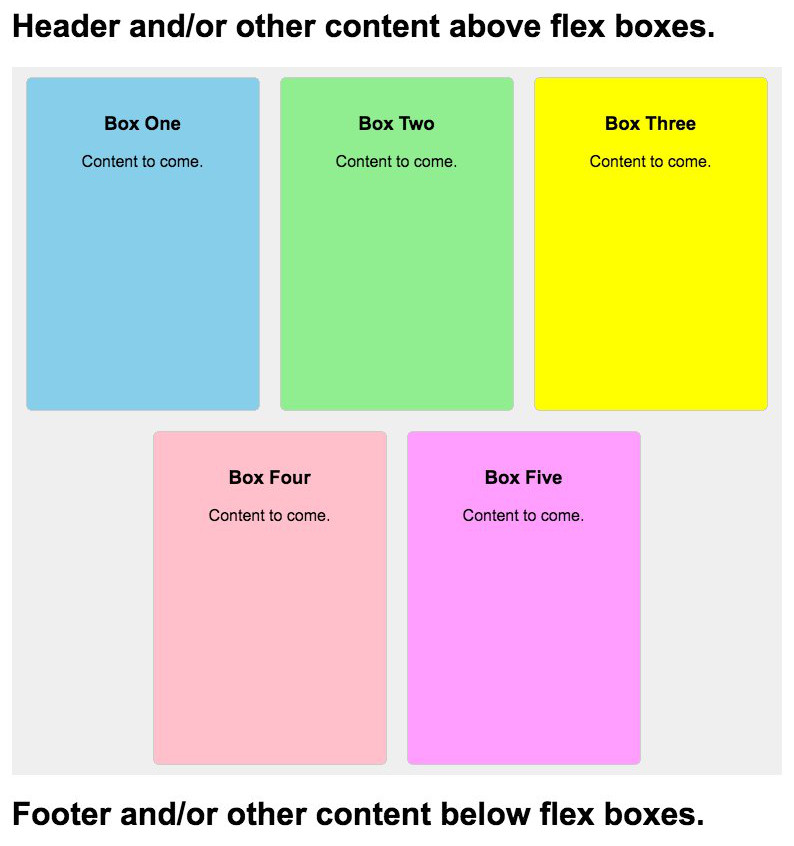
In the example accompanying this article, the flex boxes are responsive to the width of the flex container. The boxes have a static width and height, meaning they don't stretch. But they do rearrange themselves as needed when the width of the browser window changes.
The flex container has a temporary background color for easier visualization. Each of the flex boxes also has its own background color, again for better visualization.
Here is a screenshot of the example page in a scrollable div.
In case you are interested, a companion Simple Responsive Web Page Template article is available. It includes an HTML/CSS template for a 2‑column responsive page within a flex container, a main content column and a right navigation column.
Later in this article, you'll see the source code for the entire example page. Put it on your server as a temporary page. Load its URL and have a look at how the flex boxes automatically rearrange themselves as the width of the browser window changes.
On desktop/laptop computers, the width of the browser may be varied. On phones and tablets, the width of the browser adjusts when changing the view from portrait to landscape and vice versa.
To keep the example page simple, no extraneous CSS is used. There are 3 classes, only 2 directly related to flex CSS. There is not even one media tag. The only body tag style is for font size.
Let's do the style sheet first. Then, present the code for the entire web page that the screenshot is from.
The CSS
Here are the 3 classes that affect the positioning of the flex boxes. Notes follow.
.page-content-container {
	max-width:770px;
	margin:0 auto;
	}

.flex-boxes-container {
	display:flex;
	flex-wrap:wrap;
	justify-content:center;
	}

.individual-flex-box {
	width:200px;
	height:300px;
	text-align:center;
	border:1px solid #ccc;
	border-radius:6px;
	padding:1em;
	margin:10px;
	overflow:auto; /* Allows scrollbars if content doesn't fit. Use overflow:hidden; to always suppress scrollbars. */
	}
Notes —
The page-content-container affects all the content on the page, including the flex boxes. It's purpose in this template is to restrict the container to a maximum width and to center the container on wider browser windows. The CSS may be updated and new declarations added.
The flex-boxes-container is the div that holds all of the individual flex boxes. The display:flex; CSS and the flex-wrap:wrap; CSS need to remain. But the container div may be assigned other CSS.
The individual-flex-box class applies to the individual flex boxes. The width and height properties need to be present, although the dimensions may be changed. The rest of the CSS for the individual-flex-box class may be changed or removed, and other declarations added.
The Entire Example
Here is the the source code for the entire HTML web page of the example. Notes follow.
<!DOCTYPE html>
<html>
<head>
<meta http-equiv="Content-Type" content="text/html; charset=UTF-8">
<meta name="viewport" content="width=device-width, initial-scale=1.0">
<title>Template for Responsive Flex Boxes</title>
<style>
body { font-size:100%; }

.page-content-container {
	max-width:770px;
	margin:0 auto;
	}

.flex-boxes-container {
	display:flex;
	flex-wrap:wrap;
	justify-content:center;
	}

.individual-flex-box {
	width:200px;
	height:300px;
	text-align:center;
	border:1px solid #ccc;
	border-radius:6px;
	padding:1em;
	margin:10px;
	overflow:auto; /* Allows scrollbars if content doesn't fit. Use overflow:hidden; to always suppress scrollbars. */
	}

</style>
</head>
<body>
<div class="page-content-container">

<h1>Header and/or other content above flex boxes.</h1>


<div class="flex-boxes-container" style="background:#efefef;"><!-- temporary background color for container -->

<div class="individual-flex-box" style="background:skyblue;"><!-- temporary background color for box -->
<h3>Box One</h3>
<p>Content to come.</p>
</div>

<div class="individual-flex-box" style="background:lightgreen;"><!-- temporary background color for box -->
<h3>Box Two</h3>
<p>Content to come.</p>
</div>

<div class="individual-flex-box" style="background:yellow;"><!-- temporary background color for box -->
<h3>Box Three</h3>
<p>Content to come.</p>
</div>

<div class="individual-flex-box" style="background:pink;"><!-- temporary background color for box -->
<h3>Box Four</h3>
<p>Content to come.</p>
</div>

<div class="individual-flex-box" style="background:hsl(300,100%,81%);"><!-- temporary background color for box -->
<h3>Box Five</h3>
<p>Content to come.</p>
</div>

</div><!-- class="flex-boxes-container" -->


<h1>Footer and/or other content below flex boxes.</h1>

</div><!-- class="page-content-container" -->
</body>
</html>
Notes —
In the source code, you'll see class="page-content-container" used immediately below the <body> tag. The div is closed immediately above the cancel </body> tag.
Soon after that, below the the space for the masthead, you'll see class="flex-boxes-container" used immediately below the <body> tag. The div is closed above the space for the footer content. The inline style for a background-color may be removed.
The flex-boxes-container div is the container for the individual flex boxes.
Each flex box div contains class="individual-flex-box" for its style. Every flex box in this example has a temporary inline style for a background-color that may be removed.
The content of flex boxes may be anything that a web page can publish.
If you'll copy the entire above example page source code and save it as your own test page, you'll be able to tweak this and that and see what CSS tweaks affect what content.
When you have your example web page working, specify additional styling as you see fit.
My aim was to make this as simple as possible.
The template is designed so it can be modified for use at other people's web sites — "other people" being you and your clients :).
This article first appeared with an issue of the Possibilities newsletter.
Will Bontrager


