
Closer Image
You can implement this: When a mouse hovers over an image, the image appears to come closer to the surface of the web page.
I'll show you how. It requires an image (of course). CSS is used for the effect. No JavaScript and no PHP are used.
First, an example.
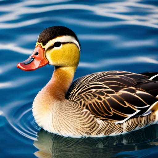
If you have a mouse, move it over the image. The image will enlarge within its div. The effect is the image moving closer to the surface of the page.
The KirkReport.org home page has an image with that effect (as of this writing; it's not our website and it might change).
The main caveat (for me) is the image won't have a responsive size. Its dimensions must be specified. If you need different sizes for different browser widths, the CSS @media tag can be used to change the image dimensions according to browser viewport width.
Unfortunately, addressing the @media tag is out of scope for this article. Two online resources that may help are @media Mozilla web page and the CSS Media Queries Guide CSS-Tricks web page.
Let's get back on track. Here is the source code for the above demonstration.
<style type="text/css">
.image-container {
   width:250px;
   height:250px;
   overflow: hidden;
   }
.image-container img { width:100%; }

.for-over-the-image {
  width:100%;
  height:100%;
  transition:transform ease 0.4s;
}
.for-over-the-image:hover { transform:scale(1.25); }
</style>

<div class="image-container">
<div class="for-over-the-image">
<img src="https://www.willmaster.com/possibilities/images/20250701.jpg" alt="duck">
</div>
</div>
There are two CSS classes, the image-container class and the for-over-the-image class.
The image-container class is where the dimensions are specified. The overflow:hidden; value is necessary for keeping the enlarging image within the div's boundaries. The image-container img class is a style specifically for the image.
The for-over-the-image class is where the effects are declared. The 0.4 part of the transition value can be changed. 0.4 specifies 0.4 seconds. To slow down the animation, make the number larger. To speed it up, make the number smaller.
At for-over-the-image:hover is where the relative size of the transformed image is specified. 1.25 means the image becomes 1.25 times as large when a mouse hovers over it. Change 1.25 according to the effect you want.
What you have with the source code is a complete working demonstration of how it works.
Adjust the CSS values and change the image to see what effects your changes have. It can be a learning experience.
(This content first appeared in Possibilities newsletter.)
Will Bontrager


