
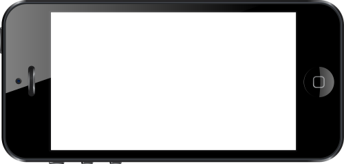
Video Runs Within Phone Image
Place an image of a phone on a web page and launch a video that appears to be running within the phone.
In actuality, the phone image is a frame around the video.
Here is a live example.
I will describe how to code for the effect. When you have that, you'll be able to use the technique for any frame around a video — tablet, computer screen, the window of a house, … .
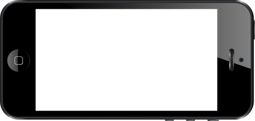
Oh, yes, the set (phone image and video) can be rotated. How to do it will be described.
Before we begin the instructions, here is a live example of the image and video set rotated ‑7 degrees.
How to Put a Video Within a Phone Image on a Web Page
There are several parts, including code that needs to be adjusted to fit the video onto the screen of the phone image.
I'll first present the code and then talk about aspects of it. Refer to the code in the source code box as needed for understanding.
There are three sections in the code below — image, div to hold the video tag, and the video tag itself — the beginning and end of each marked with an HTML comment tag. And also the div that contains all parts and keeps them together.
<div style="display:table; position:relative; transform:rotate(-7deg);">
  <!-- Phone image. -->
  <img
    src="phone.png"
    style="max-width:100%;"
    alt="phone frame">
  <!-- End phone image. -->
  <!-- Div holding video tag. -->
  <div
    style="
      background-color:transparent;
      position:absolute;
      top:7%;
      right:14%;
      bottom:9%;
      left:14.5%;">
    <!-- Video tag. -->
    <video
      controls
      style="
        position:absolute;
        width:100%;
        height:100%;
        padding-top:0%;
        padding-right:0%;
        padding-bottom:0%;
        padding-left:0.5%;">
      <source
        src="https://www.willmaster.com/videos/TechTip935Video.mp4"
        type="video/mp4">
    </video>
    <!-- End video tag. -->
  </div>
  <!-- End div holding video tag. -->
</div>
The CSS declarations in the code are the minimum (or optional, if so indicated). Additional CSS may be applied.
The Container
The first line of the code begins the div that contains all parts and keeps them together (and ends with the last line of the code). The div contains two required CSS declarations and an optional one.
-
Required declarations.
-
display:table;to restrict the width of the div to the width of the image. -
position:relative;to position elements absolutely within the div.
-
-
Optional declaration.
-
transform:rotate(-7deg);To rotate the entire phone image/video set. The-7degmay be changed to rotate at a different angle.
-
The Image
The image tag is in the green colored section of the source code immediately below the code's first line.
The src attribute is where you specify the URL to your phone image.
The max-width:100%; CSS declaration is required for making the image responsive to screen widths and yet not larger than its natural image size.
Fitting the Screen Area
The div that holds the video tag is the blue colored section of the source code
That tag's CSS needs to be adjusted until the div fits the phone image screen area as exactly as you can make it.
To do that, you first need to do 2 things temporarily. When the CSS is adjusted to fit the screen area, you reverse these temporary changes.
-
Change the div's
background-color:transparent;CSS declaration tobackground-color:yellow;so you can visually see the div location. (Color other than yellow may be specified; any color that contrasts with the colors of the image.) -
Comment out the red colored video tag section so the video doesn't display while you are fitting the div to the screen area. To comment out the section, insert
<!--immediately above the begin<videoline and insert-->immediately below the cancel</video>line.
Everything is now ready for adjusting the div to the phone image screen area.
The div is positioned by specifying how far from each of the image edges the div shall extend to. The specifications are expressed as percentages so the distance is adjusted accordingly for any screen width. The percentages may be expressed with whole or decimal numbers.
As an illustration, the percentages for the above examples are:
top:7%;

right:14%;

bottom:9%;

left:14.5%;
Adjust those until the div covers your phone image screen area as close as you can get it.
Then, reverse the 2 temporary changes you made above, making the background color transparent and removing the temporary HTML comment tags above and below the video tag.
The Video
Within the video is a source tag. The source tag has an src attribute. At the src attribute is where you specify the URL to your video. (See Videos From Your Website for more information about using the video tag to put videos on your websites.)
Something to contend with is this:
- The screen area of a phone has specific dimensions — which are fixed.
- Videos have their own dimensions — which vary from video to video.
The video's dimensions will remain proportional. The width can be made smaller, for example, and the height will adjust proportionally.
When the video dimension proportions are different from the phone image screen proportions, some sections of the video may extend past the screen area and other sections may not cover the entire screen area.
Generally, it is preferable to have the video entirely inside the screen area even when the screen area isn't entirely covered.
To adjust the position of the edges of the video, the video tag's padding-… values can be used. As earlier, percentages are used. Percentages can be expressed as whole number or decimal numbers.
As an illustration, the percentages for the above examples are:
padding-top:0%;

padding-right:0%;

padding-bottom:0%;

padding-left:0.5%;
It is possible to use the padding-… values to intentionally make the video smaller than the screen area if that design is desirable.
The Result
The result is a live video player on your web page positioned to run within the screen area of an image of a phone.
Your Videos Published On Your Website lists other articles related to publishing videos with the video tag.
(This article first appeared with an issue of the Possibilities newsletter.)
Will Bontrager


