
Image Hue Shift
It is possible to shift the hues of an image. All hues are shifted equally.
Let's demonstrate. Notice the orange−ish color on the duck's cheek.
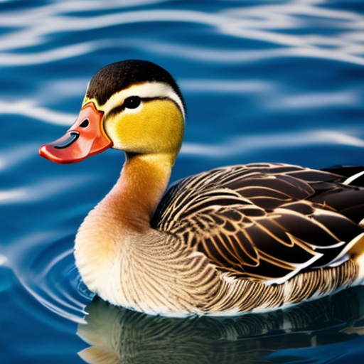
Now, let's shift the hues of the entire image until the cheek is green−ish.
All the hues in the image shifted, including the colors in the cheek area.
If you want to do stuff like that with some of your images, here's how.
You could do trial and error until you get what you want, which can be fun. I enjoy doing things with trial and error to learn about the various effects my trials have.
However, unless you wish to immerse yourself into possibilities, it probably is better to visualize the hue bar.
The hues of an image are shifted left or right along a hue bar of colors. A hue bar represents 360 degrees of colors. Here is a representation.

At the left end is degree 0. At the right end is degree 359. Imagine the bar wrapped around so the 0 and the 359 meet.
That imagination will be used to determine how many degrees to shift the hues of an image.
In the demonstration further above, the hues were shifted 100 degrees. The orange−ish cheek became green−ish.
On the hue bar, you'll see the orange band and the green band. The green band is about 100 degrees to the right of the orange band.
This is the CSS that was used to shift the hues in the demo image:
filter:hue-rotate(100deg);
The 100deg value can be any whole number, positive or negative, with "deg" appended.
Here is where your imagination of the wrap-around hue bar comes in. If the result of the hue shift calculation is more than 359deg, the result wraps around. Similarly, if the result is less than -0deg, the result wraps around.
Here is the same image, but with the hue-rotate() being -100deg. All hues are shifted left instead of right along the wrap-around hue bar. The hues for the orange−ish cheek colors wrap around and become the hues for pink−ish.
Here are the three img tags for the demonstration images.
<img src="https://www.willmaster.com/possibilities/images/20250701.jpg" style="max-width:100%;" alt="demo image">

<img src="https://www.willmaster.com/possibilities/images/20250701.jpg" style="filter:hue-rotate(100deg); max-width:100%;" alt="demo image">

<img src="https://www.willmaster.com/possibilities/images/20250701.jpg" style="filter:hue-rotate(-100deg); max-width:100%;" alt="demo image">
When an image has its hues shifted, all the hues in the image shift by an equal amount.
The filter:hue-rotate(); CSS rule is specialized. It sure comes in handy when a hue shift is desired.
(This content first appeared in Possibilities newsletter.)
Will Bontrager
Was this article helpful to you?
(anonymous form)
All information in WillMaster Library articles is presented AS-IS.
We only suggest and recommend what we believe is of value. As remuneration for the time and research involved to provide quality links, we generally use affiliate links when we can. Whenever we link to something not our own, you should assume they are affiliate links or that we benefit in some way.
More "Website Development and Maintenance" Articles
Other Recent Articles from the Library


© 2001-2011 Bontrager Connection, LLC
© 2011-2026 Will Bontrager Software LLC
© 1998-2001 William and Mari Bontrager
© 2001-2011 Bontrager Connection, LLC
© 2011-2026 Will Bontrager Software LLC