
Pie Chart Maker
When you need a quick pie chart, or several, the web page-based Pie Chart Maker can be used in lieu of firing up your drawing software.
Here is a screenshot of the one being oriented on today. It includes the text box where you specify the width of the slices and their colors. (Any valid HTML color can be specified.)
Above the pie chart, you see where the slices are specified. The pie chart is generated according to your numbers and colors.
Below the generated pie chart, not visible in this screenshot, will be the CSS declaration to make the pie slices exactly the way they were generated.
In other words, there are two ways the Pie Chart Maker can be used:
-
Generate the pie chart so you can make a screenshot for use elsewhere.
-
Generate the pie chart so you have the CSS declaration for repeating that very same chart on other web pages.
Note: Some browsers, especially older versions, don't know how to handle the CSS conic-gradient definition when applied to a background image.
Below is a live pie chart maker.
Use it at this website. Or copy the source code (further below) and put it on your website.
The width of pie slices can be calculated as degrees or as percentages.
When you make a pie chart, you can screenshot it and/or copy the CSS declaration to reproduce the pie chart on other web pages.
Custom Pie Chart Maker
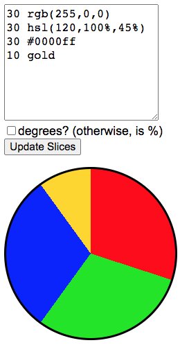
In the text box below, use one line for each pie chart slice. The lines are formatted with the degree (0-360) or percentage (0-100) for the slice, a space, and the slice color.
If the total of the pie slices is below 360 degrees or 100%, the last slice will make up the difference.
If the total of the pie slices is more than 360 degrees or 100%, the last slice(s) will either be narrowed or dropped.
The box below the pie chart contains the CSS declaration for the pie that is being displayed.
NOTE: Some older versions of browsers ignore the CSS3 conic-gradient definition. If that's the case for your browser, you will see a white pie with no slices and the "Update Slices" button won't work.
degrees? (otherwise, is %)
If you wish to put the pie chart maker on your own website, instead of using it here, copy the source code below and paste it into your web page.
<h3 style="margin-top:0;">
Custom Pie Chart Maker
</h3>
<p>
In the text box below, use one line for each pie chart slice. The lines are formatted with the degree (0-360) or percentage (0-100) for the slice, a space, and the slice color.
</p>
<p>
If the total of the pie slices is below 360 degrees or 100%, the last slice will make up the difference.
</p>
<p>
If the total of the pie slices is more than 360 degrees or 100%, the last slice(s) will either be narrowed or dropped.
</p>
<p>
The box below the pie chart contains the CSS declaration for the pie that is being displayed.
</p>
<p>
NOTE: Some older versions of browsers will not render the pie chart. If that's the case for your browser, you will see a white pie with no slices and the "Update Slices" button won't work.
</p>
<p>
<textarea id="numbers" type="text" onkeyup="EmptyTheDeclarationCSSdiv()" onchange="UpdatePieSlices()" style="height:10em; max-width:250px; font-size:1rem;">
30 rgb(255,0,0)
30 hsl(120,100%,45%)
30 #0000ff
10 gold
</textarea>
<br>
<input id="measurement" type="checkbox" onchange="UpdatePieSlices()" value="deg">degrees? (otherwise, is %)
<br>
<input type="button" value="Update Slices" onclick="UpdatePieSlices()">
</p>
<div id="pie-sliced" style="width:250px; height:250px; border:3px solid #000; border-radius:50%; background:conic-gradient(rgb(255,0,0) 30%, hsl(120,100%,45%) 30% 60%, #0000ff 60% 90%, gold 90% 100%);"></div>
<p id="CSS-declaration" style="border-bottom:0; min-height:.25in; border:1px solid #666; border-radius:.5em; padding:1em;"></p>
<script>
function UpdatePieSlices()
{
var numbers = document.getElementById("numbers").value.replace(/^\s*/,"");
numbers = numbers.replace(/\s*$/,"");
var measurement = document.getElementById("measurement").checked ? "deg" : "%";
var ending = measurement=="%" ? "100" : "360";
var slices = new Array();
var lines = numbers.split(/[\r\n]+/);
var count = lines.length;
var lastnumber = 0;
for( i=0; i<count; i++ )
{
if( ! lines[i].match(/[0-9]/) ) { continue; }
lines[i] = lines[i].replace(/^\s*/,"");
lines[i] = lines[i].replace(/\s*$/,"");
var ta = lines[i].split(/\s+/);
if(ta.length<2) { continue; }
var color = ta[1];
var number = ta[0].replace(/[^0-9]/g,"");
number = parseInt(number) + parseInt(lastnumber);
if( i == (count-1) || number>ending ) { number = ending; }
var plusLastNumber = parseInt(lastnumber)+parseInt(measurement);
if( plusLastNumber > ending ) { plusLastNumber = ending; }
var lastNumberPosition = '';
if( lastnumber>0 ) { lastNumberPosition = " " + lastnumber+measurement; }
slices.push(color+ lastNumberPosition +" "+number+measurement);
lastnumber = number;
}
var thePie = "conic-gradient(" + slices.join(", ") +")";
document.getElementById("pie-sliced").style.background=thePie;
document.getElementById("CSS-declaration").innerHTML = "background:"+thePie+";";
}
function EmptyTheDeclarationCSSdiv()
{
document.getElementById("CSS-declaration").innerHTML = "<span style='color:#999;'>Calculated CSS declaration will be here.</span>";
}
EmptyTheDeclarationCSSdiv();
UpdatePieSlices();
</script>
If you wish to make the pie chart a different size, or give it a different border, change the style of the div with id="pie-sliced"
To use the generated background:conic-gradient(…) CSS declaration to make your own chart, paste the style into a div. If you also use the CSS border-radius:50% declaration, it will make a rounded pie border.
Example:
<div
   style="
      width:250px;
      height:250px;
      border-radius:50%;
      background:conic-gradient(rgb(255,0,0) 30%, hsl(120,100%,45%) 30% 60%, #0000ff 60% 90%, gold 90% 100%);">
</div>
This is a fun little toy.
It can also be very useful. Screenshots can be made of the pie chart for publishing in newsletters or PDFs. The generated CSS declaration can be used to publish the pie chart on web pages.
This article first appeared with an issue of the Possibilities newsletter.
Will Bontrager


